Thursday, May 20, 2010
Surrealism
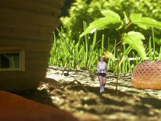
I call this photo "It's a big world". When taking this photo, I wanted to capture the light/dark contrast between the light and the shadow of the pot. I also wanted to making the budding plant in the middle my focal point. When in photoshop, I tweaked the vibrance and contrast adjustments to make the contrast richer and the light/dark difference more noticable. I further used layer masks and blending modes to place many different elements into the photo. I cut in the runner, the snake, the window and the brown area in front of the pot to create the illusion of a world beneath the grass, a world where there are little houses and large, scary snakes. I think this photo is charming and causes the reader to think about a world different from their own. All in all, I achieved exactly what I wanted to achieve with this photograph. My only criticism is the brown addition in the bottom left hand corner. It didnt blend in the way I wanted it to.
Tuesday, May 18, 2010
Theme 2 Photo
I love the simplicity of this shot. Behind the runner is a wide, bright arch that contrasts the dull and mundane concrete. In photoshop, I really wanted to make the red shorts of the rollerblader the focal point. I REALLY increased the vibrance so it would stand out. I also slightly adjusted the contrast to make the light/dark difference a little sharper.
Something about this photo is very peaceful. I love the splash of color the red shorts bring and the image of the roller blader caught in a streak of motion.This scene reminds me of how much I love long runs and the blissful exhaustion you feel at the end. You feel like you're in a haze but your entire body feels alive and energized. The only thing I would maybe fix is the vibrance. It may be a little too overdone.
Friday, May 7, 2010
Text + Image
I chose this photo because there is something magical about it. It brings out the inner child that exists in every one of us. This photo is special and playful and inspiring. In that light, I chose an inspirational quote about belief in one's self and how that can affect the world. I placed this quote in a all encompassing circle so it was in harmony with the circles of light in the center of the photo. My font color was a light orange/gold that tied in with the light without drawing too much attention from my focal point.
In photoshop, I used a clone tool to cover up the faint outline of a garage off to the right side and slightly increased the contrast to allow the light to appear brighter. I believe this photo is simple and beautiful. Somehow, the composition is compelling and yet peaceful and harmonious. When I look at this photo I see an image of inspiration, a photo that really makes the viewer think. The only thing I wish I could change was the stone at the bottom of the photo. I didn't think I had enough material to clone it into grass. I believe it distracts from the focal point.
Friday, April 30, 2010
Composite photo
For this photograph, I was really looking for a subtle and thought-provoking light/dark contrast. I chose two night photos, one picture was of Lake of the Isles with the twisted branches of a tree barely illuminated, the other was of a brightly lit city street. By putting these pictures together, I was able to draw more attention to the interesting shapes of the branches and make it look as though there was a large city behind it in the distance.
Once I put the photos on top of each other, I used the lighten blending mode to bind the two photos together. By using lighten instead of darken or burn I was able to make the light parts of the photo more visible and clear.
I really like the creativity of this photo. It's very subdued and calming, but also mysterious and alluring. By having the lights in the distance, the viewer is meant to feel interest and perhaps some desire to see what lies behind the dark tree in the city beyond. My only modification would be to make the image a little clearer. The image of the tree was a little out of focus to begin with.
Monday, April 26, 2010
History Brush
I chose to use the history brush with this photo because of the interesting contrast it creates. I decreased the saturation of the entire picture and then selected the blurry outline of the spinning top. I then clicked on the history brush and carefully brought out the deep yellow hue of the top.
I actually LOVE this photo. The punch of color creates a really fun contrast and emanates a feeling of warmth and fun.
I usually have something that I would like to improve about each of my photographs, but for this one I couldn't imagine it any other way. My lines are crisp and clear and the color is simply fantastic!!
Thursday, April 15, 2010
Pop-Art Portrait
1. I first used a split-complementary color scheme. I chose blue to be my base color, and then addeded in little portions of yellow-orange and orange-red because they are adjacent to blue's compliment. Because of this unique scheme the photo seems lively and upbeat.
2. For my second square, I employed a monochromatic color scheme; burying my subject in various shades of purple. The single, cool color gives off a peaceful feeling.
3. In the bottom, left-hand corner I placed an analogous color scheme. This scheme, focusing on shades near to one another, contains shades of orange, red-orange, and green-orange. This scheme is very harmonious to the eye.
4. For my final image, I chose a ....duh duh duh...TRIADIC SCHEME!!! This is definitely the most striking scheme of the four. I used the evenly-spaced colors blue-green, light orange, and light purple to create a really funky palatte with a lot of interest.
Overall, I really liked how this assignment turned out. My palattes are fun and unique, creating a very fresh and energetic feeling. I also really tried to balance the colors out so there wasn't an overwhelming amount of warm or cool hues.
If there was one thing I could change about my images, it would be to correct the edges on the rims of the sunglasses. Even though I tried really hard to get those edges as perfect as possible, it was still a little uneven.
Monday, March 22, 2010
Natural/Studio Lighting Portraits
In my natural lighting portait, I wanted to capture my subject's profile. I used backlighting to make the silhouette more striking and defined. I took the picture while she was sitting in a casual position because I wanted to capture her at ease. I also took the photo from a low perspective to draw interest by making the subject seem larger.
In photoshop, I specifically used the dodge tool to lighten the pixels in deep shadow because I felt some of the light/dark contrast was too dramatic. I wanted the image to be softer. I used dodge on the subject's face, neck, and arms particularly.
I enjoy looking at this picture. There is a warmth and softness in the photo that I don't often capture in my images. I am very pleased that I was able to capture my subjects profile without having too dramatic a line.
My studio lighting portrait was taken from the front perspective. I wanted the non-diffused light to strike half of her face to capture a very dramatic light/dark contrast. I like this shot because while we were shooting we were laughing, and this represents a moment where the subject slipped out of the stiffness of a posed photo and let loose. Her silly smile captures more of who she is.
In photoshop, I employed both the dodge and burn tools to balance the image more. While I was looking for high contrast, some of it was too dramatic for me. I used dodge to lighten the darker half of the subject, making the hair and colors of her jacket more visible. I also touched up the other side of her face with a little burn.
I like this photo. As I stated earlier, her embarrassed little smile adds a playfulness that cannot always be caputed in an image. However, I wish the image would have been in a little more focus. The picture seems a little grainy.
Subscribe to:
Posts (Atom)